Branding Kōken
Visual identity
Logo design
Typography
Art direction
Challenge
Challenge
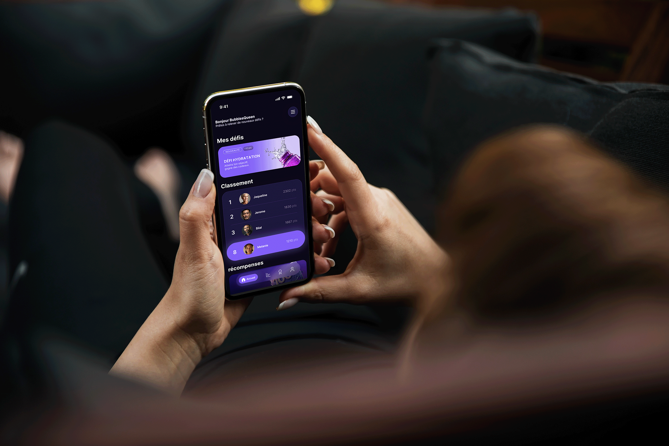
Following the rebranding of Libpass, the client tasked us with creating the brand identity for Koken — a distinct yet connected initiative. While Libpass focuses on corporate wellness and team engagement, and Koken on individual performance and gamified motivation, both stem from the same original vision. The challenge was to craft an identity that feels independent yet visually aligned with Libpass, ensuring consistency across the ecosystem. Unlike Libpass, Koken required a stronger emphasis on UI and UX to support a fully mobile-first, engaging user experience.
Solution
Solution
We built on Libpass' visual foundations by preserving continuity in typography, layout, and color harmony. For Koken, we developed a more dynamic and action-driven identity to reflect its energetic spirit. This included a bold logo, a motivation-focused color palette, and clear, human-centered typography. We also designed key UI screens and contextual mockups to showcase the app’s gamified experience. This allowed Koken to assert its own identity while maintaining visual synergy with Libpass, uniting both brands within a consistent and purposeful ecosystem.

No items found.
• Let’s Build Your Product Next
Design that solves real problems and delights users.
We help startups and established teams turn complex problems into seamless digital experiences. Whether you're building from scratch or improving an existing product - we bring clarity, creativity, and execution.

• Construisons votre produit Suivant
Une conception qui résout des problèmes réels et ravit les utilisateurs.
Nous aidons les startups et les équipes établies à transformer des problèmes complexes en expériences numériques transparentes. Que vous partiez de zéro ou que vous amélioriez un produit existant, nous vous apportons clarté, créativité et exécution.